Southern California has long been renowned for its air pollution. It also has become recognized as a leading innovator and exporter of air pollution science and regulation. From one angle, this makes sense: that problems drive the development of better science and more effective regulation. The story is more tangled, however, doubling back to show that air quality in Southern California has not steadily or uniformly improved -- gross air pollution hotspots remain, especially in communities of color, and the overall mixtures remain difficult to understand and mitigate. Furthermore, the air regulation model exported in California’s name may carries with it ways of seeing pollution that undercut effective, equitable and sustainable response. problems that locate sources of both pollution and responsibility in ways that undercut sustainable response.
In this essay, we’ll tell the twisted story of air pollution in Southern California, drawing out how it has been visualized in particular ways at different times, often framed by vested interests. It will be a story about becoming toxic -- about ways toxicity is produced scientifically, politically, and discursively as well as chemically,
Writing about nuclear hazards, historian Gabrielle Hecht develops the concept of “nuclearity” to describe how uranium isn’t always or necessarily recognized as hazardous -- especially when the people and ecologies exposed “don’t count,” or are disconnected from circuits of meaning through which uranium becomes “nuclear” (and therein recognized as hazardous). Uneven politicization of uranium mines and miners in Africa are a key focus of her work. Nuclearity, Hecht argues, is not a given or essential, it is produced through many devices: standardized definitions, laws and media, media coverage, scientific studies, and so on. Similarly, air -- even terrible air -- becomes visible -- through scientific, community and policy work, often technically enabled. We’ll tell that story.
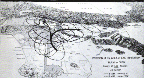
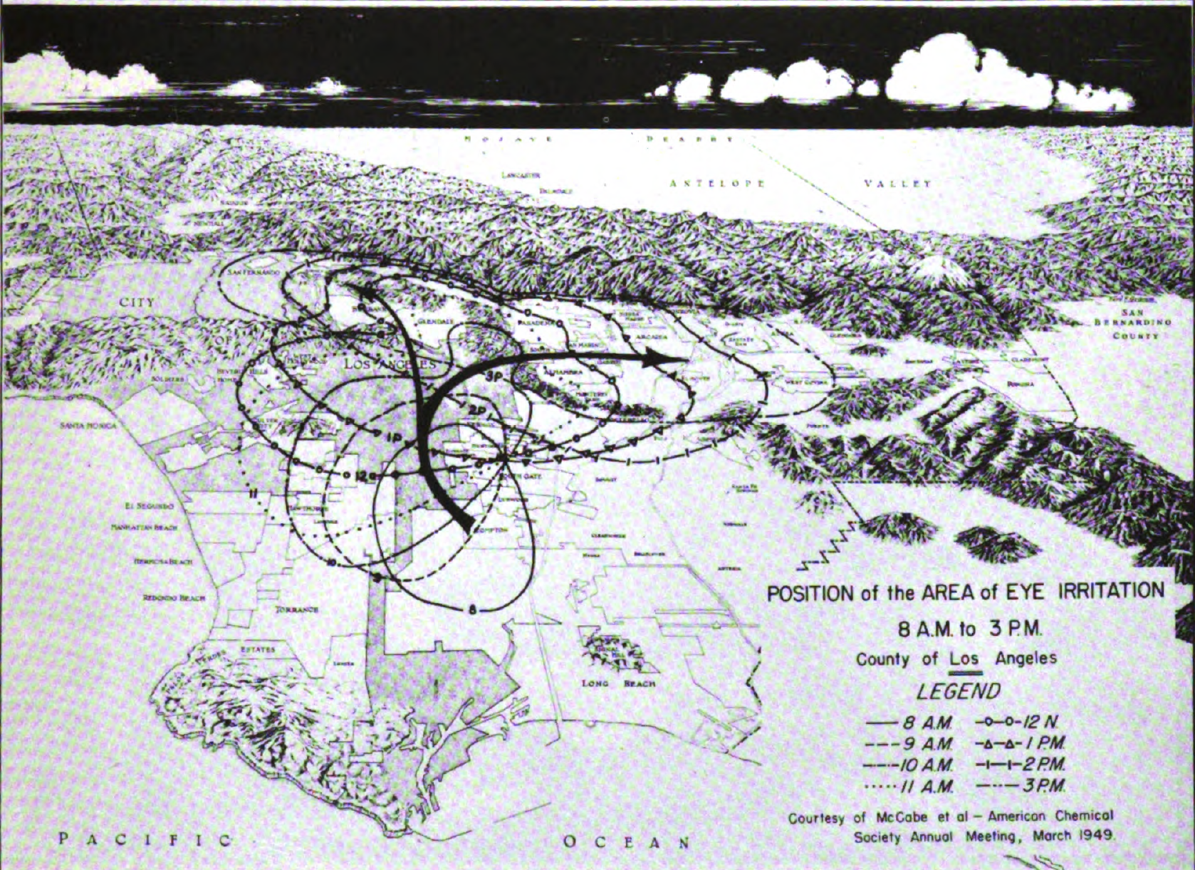
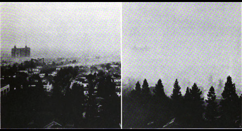
Early efforts at visualizing air pollution trace back to the eye -- eyes, more accurately, in human bodies distributed throughout Los Angeles County communities. It's all about the eyes -- as bio-indicators, and as site of toxic action -- not the lungs. The first and at the time only physiological effect of smog that was mapped was eye irritation. This geography of eye irritation resembles a topographic map, or a map of barometric pressure -- not surprisingly, given that meteorological data ws the most collected and readily available data there was. A moving zone of "lachrymation" is tracked over the course of a day, as it slowly shifts north and east, into the San Fernando Valley and towards San Bernardino. The source, or at least the origin of the arrow and the center of the earliest 8 a.m. irritation circle, is Compton.

Data like this was used to construct visualizations like that in the previous image. The SRI researchers decided that blink rate was the most objective measure of eye irritation.

The SRI researchers used seemingy insane devices such as this to measure blink rates. Polluted air of varying degrees and composition is presumably pumped into those goggles via the black tubes running down his chest, while the photometer attached to the left goggle eye registers the blink -- no Geertzian ambiguity or interpretability here, no sir...