
Anonymous, "Exposure ... to information (Revision) ", contributed by Alice Chen, Center for Ethnography, Platform for Experimental Collaborative Ethnography, last modified 19 January 2019, accessed 24 January 2025. http://centerforethnography.org/content/exposure-information-revision
Critical Commentary
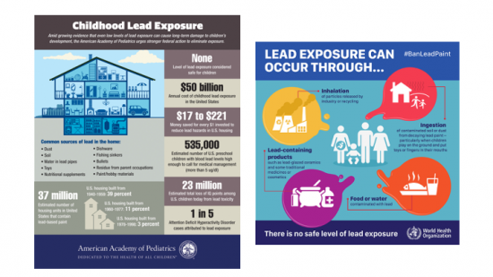
Caption: Two infographics on lead exposure and common sources of lead exposure, the left is from the American Academy of Pediatrics and the right is from WHO. The information in these two infographics points to lack of knowledge in the public on lead risk and lead poisoning. How much lead exposure is safe? Where are the sources of lead?
Design Statement: I am interested in infographics because they index potential knowledge gaps between the public and scientists or government officials. These two infographics on lead poisoning are indicative of what the employees and volunteer’s non-profit organizations and governing bodies deem to be missing information among the public.
Infographics are often seen as an important form of communication between different social and cultural groups as their purpose is for experts to distill large amounts of often complicated information into easily digestible information for a broader public. However, in hoping to raise awareness among the public, infographics can also incidentally become a form of surveillance and oppression, especially for those who live in homes and neighborhoods that have high amounts of lead. Those who know the signs and causes of lead poisoning can be made to feel guilty and/or responsible for instances of lead poisoning, especially since most people are left without any solutions or actions to remove the lead.